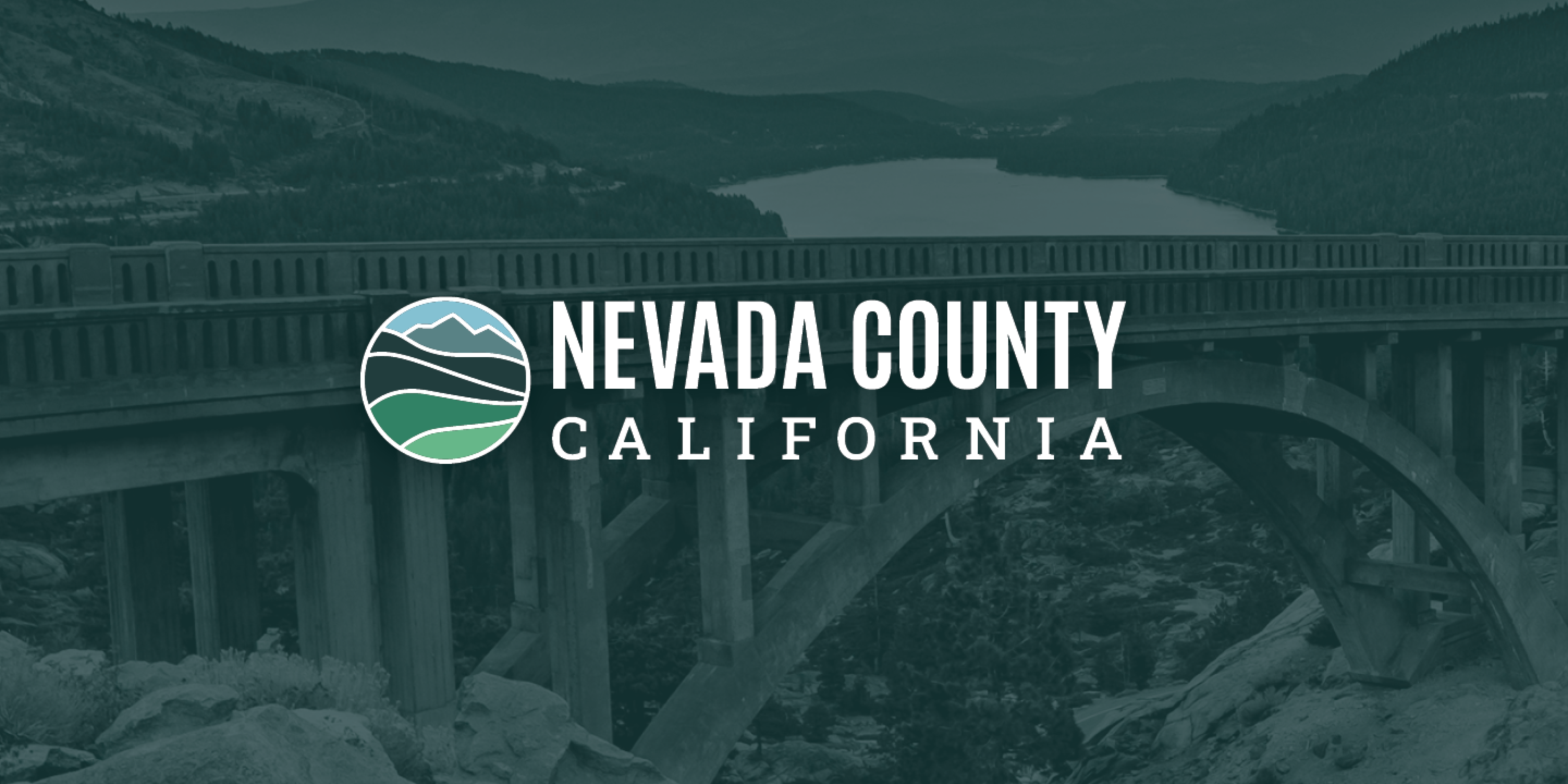
Led the development of a county-wide brand identity system for Nevada County, creating a unified visual framework to support a major website redesign, bring consistency to department communications, and improve clarity across public-facing services.
Challenge
Nevada County was preparing for a major website redesign but lacked a centralized brand system. While the County had an official seal and an existing web mark, neither functioned as a flexible identity system that departments could use consistently. Over time, many departments had created their own logos and visual styles, making County communications feel fragmented and harder for residents to navigate.
The existing website also relied on a visual approach that was difficult to scale. Many service graphics were built as custom photo compositions instead of simpler icons or reusable designs. The bright, limited color palette and heavily composited imagery made the system cumbersome to update and hard to extend across a large organization with diverse departments, programs, and communication needs.
The project required more than a refreshed logo. It needed a practical identity system that could create continuity across departments, simplify production, and give the new website a clearer, more flexible visual foundation.
Previous website and service graphics relied on custom image compositions and a limited visual palette, creating a system that was difficult to maintain or scale.
Approach & Role
I partnered with County leadership and the communications team to define a unified brand direction that could work across the website, department communications, public-facing services, and internal templates. The goal was to create a system that felt recognizable and place-based, but was also practical for staff to apply across a wide range of use cases.
I partnered with County leadership and the communications team to define a unified brand direction that could work across the website, department communications, public-facing services, and internal templates. The goal was to create a system that felt recognizable and place-based, but was also practical for staff to apply across a wide range of use cases.
Concept Development
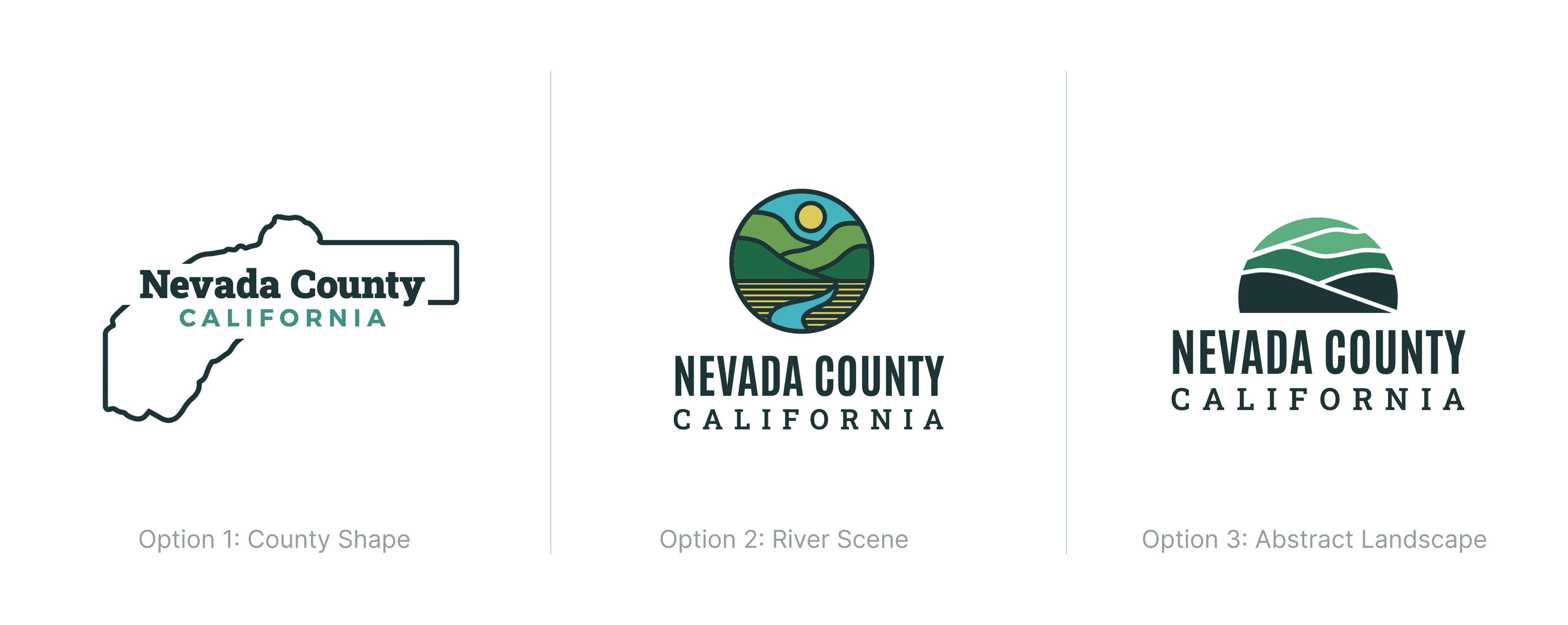
From there, I developed and presented three initial identity concepts exploring different ways to express Nevada County’s landscape. After a direction was selected, I refined the concept into a flexible identity system for web and print communications, with guidance for the County mark, department lockups, expanded color palette, typography, hierarchy, and consistent application across touchpoints.
From there, I developed and presented three initial identity concepts exploring different ways to express Nevada County’s landscape. After a direction was selected, I refined the concept into a flexible identity system for web and print communications, with guidance for the County mark, department lockups, expanded color palette, typography, hierarchy, and consistent application across touchpoints.
The selected direction used landscape-inspired forms to connect the identity to Nevada County’s geography. During refinement, I reduced the abstraction of the original concept (option 3), evolving the rolling hills into a clearer transition toward the High Sierra while preserving the river-inspired movement and color palette.
Identity System
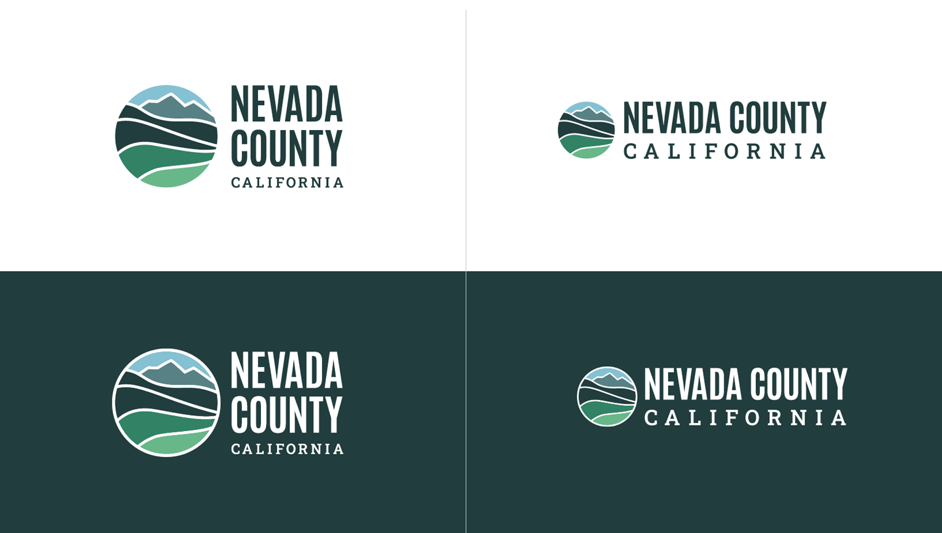
I led the development of the logo system and comprehensive brand guidelines to support consistent use across teams. The system included a primary County mark, department lockups, color and typography guidance, and practical usage examples for web and print communications.
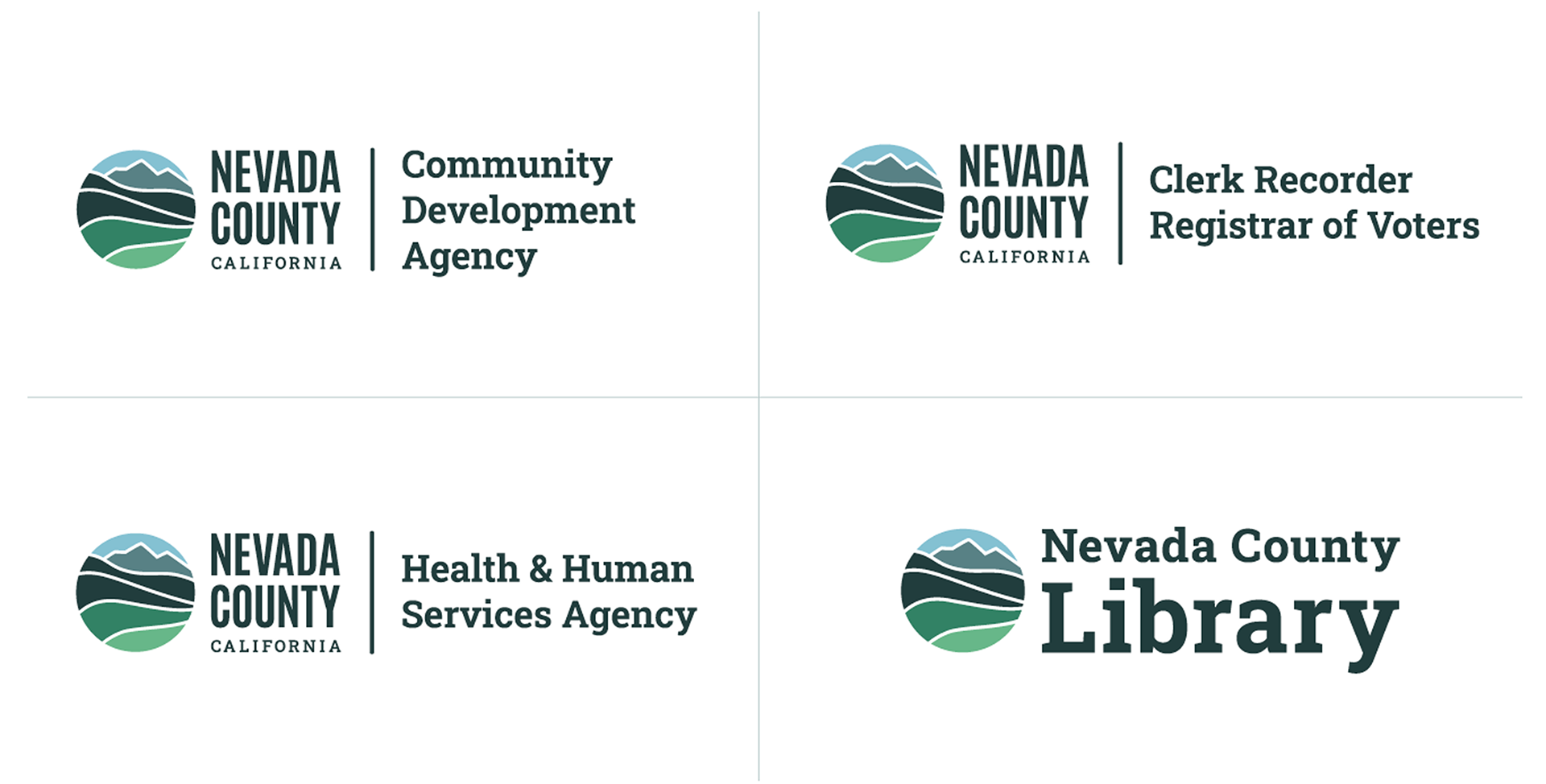
Department Lock-ups
Created a lockup system that allowed departments to maintain clear association with the County while reducing the need for separate logos.
Created a lockup system that allowed departments to maintain clear association with the County while reducing the need for separate logos.
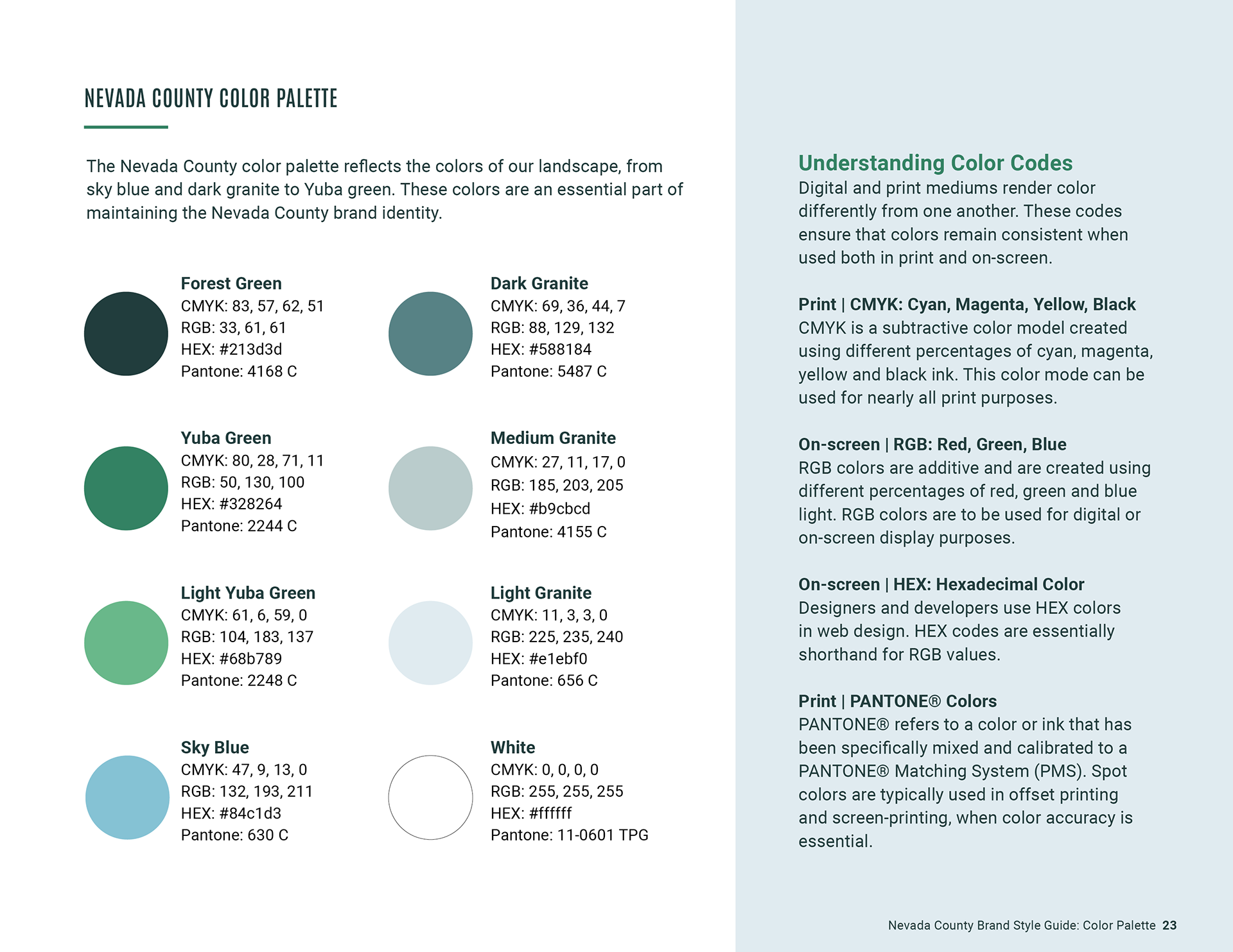
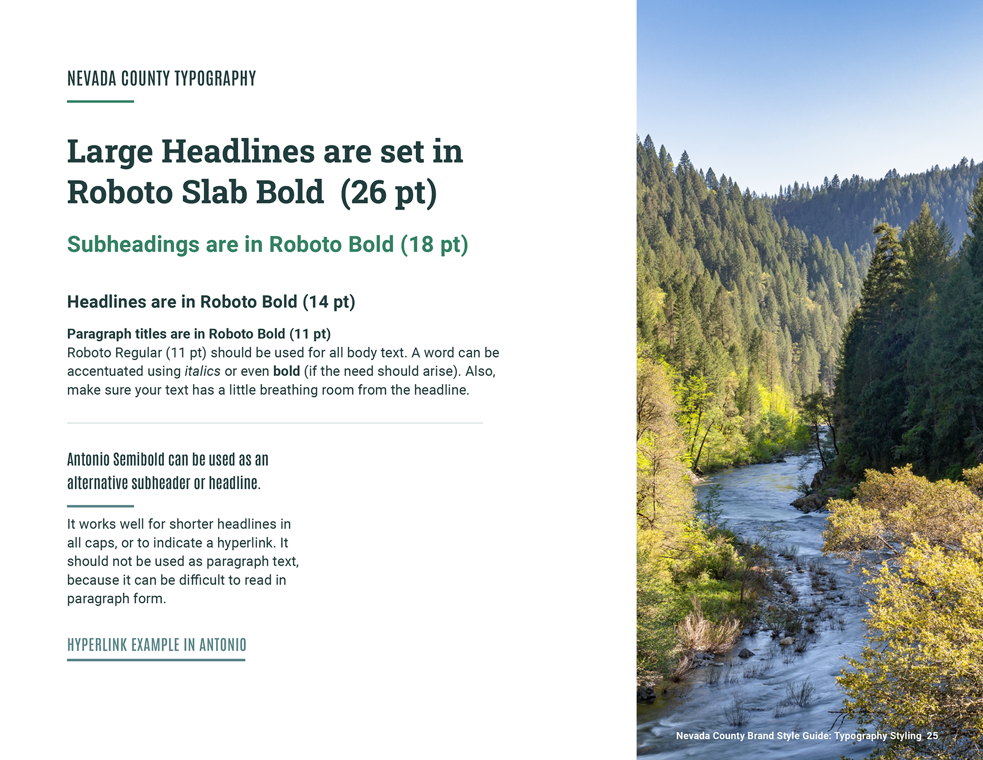
Color & Typography Guidance
Expanded the visual palette and introduced simpler, more scalable graphic treatments to reduce reliance on one-off image compositions.
Expanded the visual palette and introduced simpler, more scalable graphic treatments to reduce reliance on one-off image compositions.
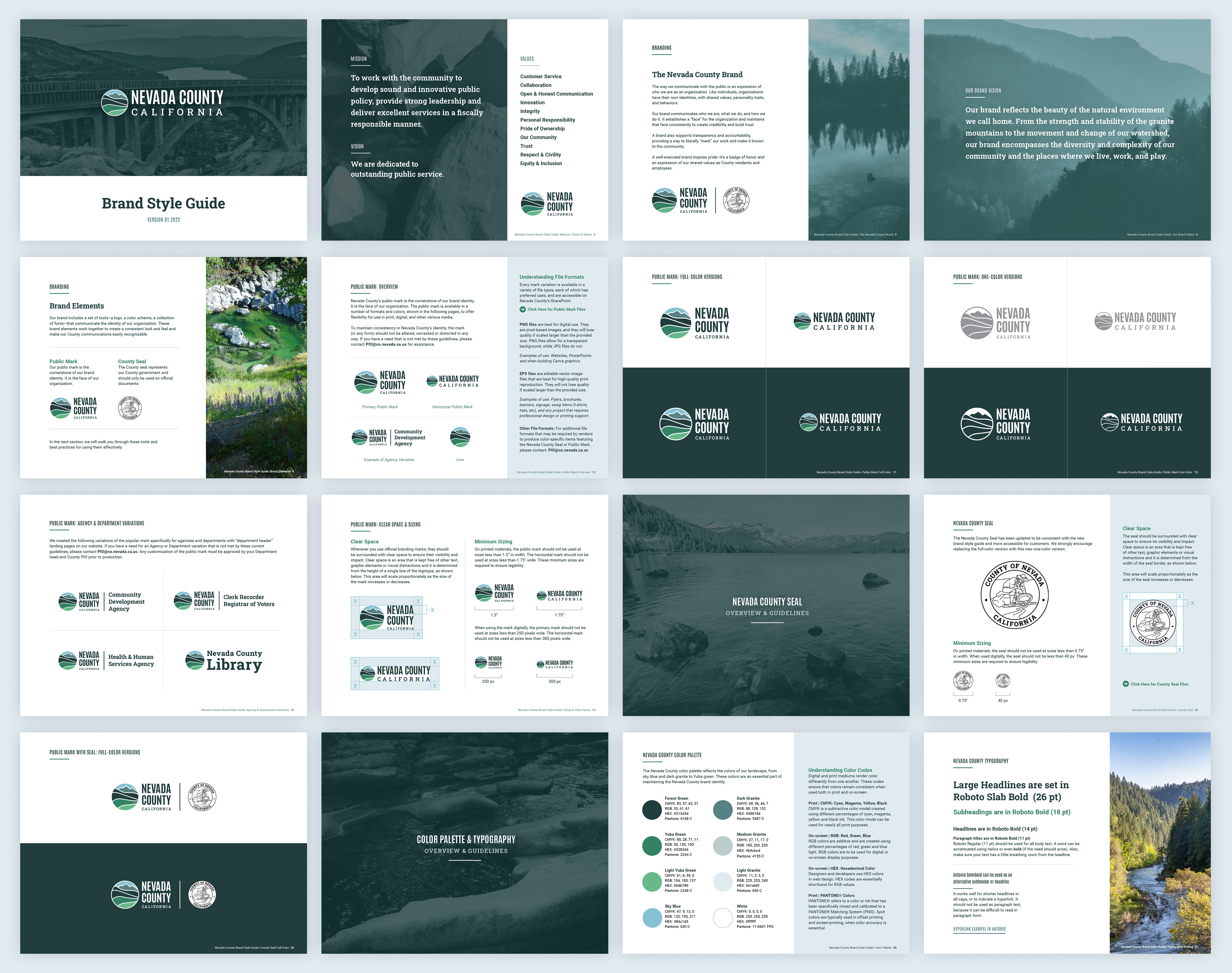
Brand Guidelines
Built a comprehensive style guide to help teams apply the identity consistently across communications.
Built a comprehensive style guide to help teams apply the identity consistently across communications.
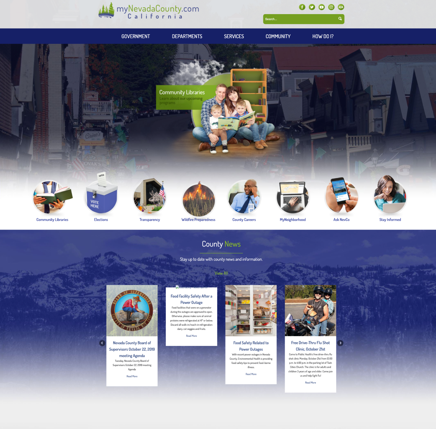
Website Art Direction
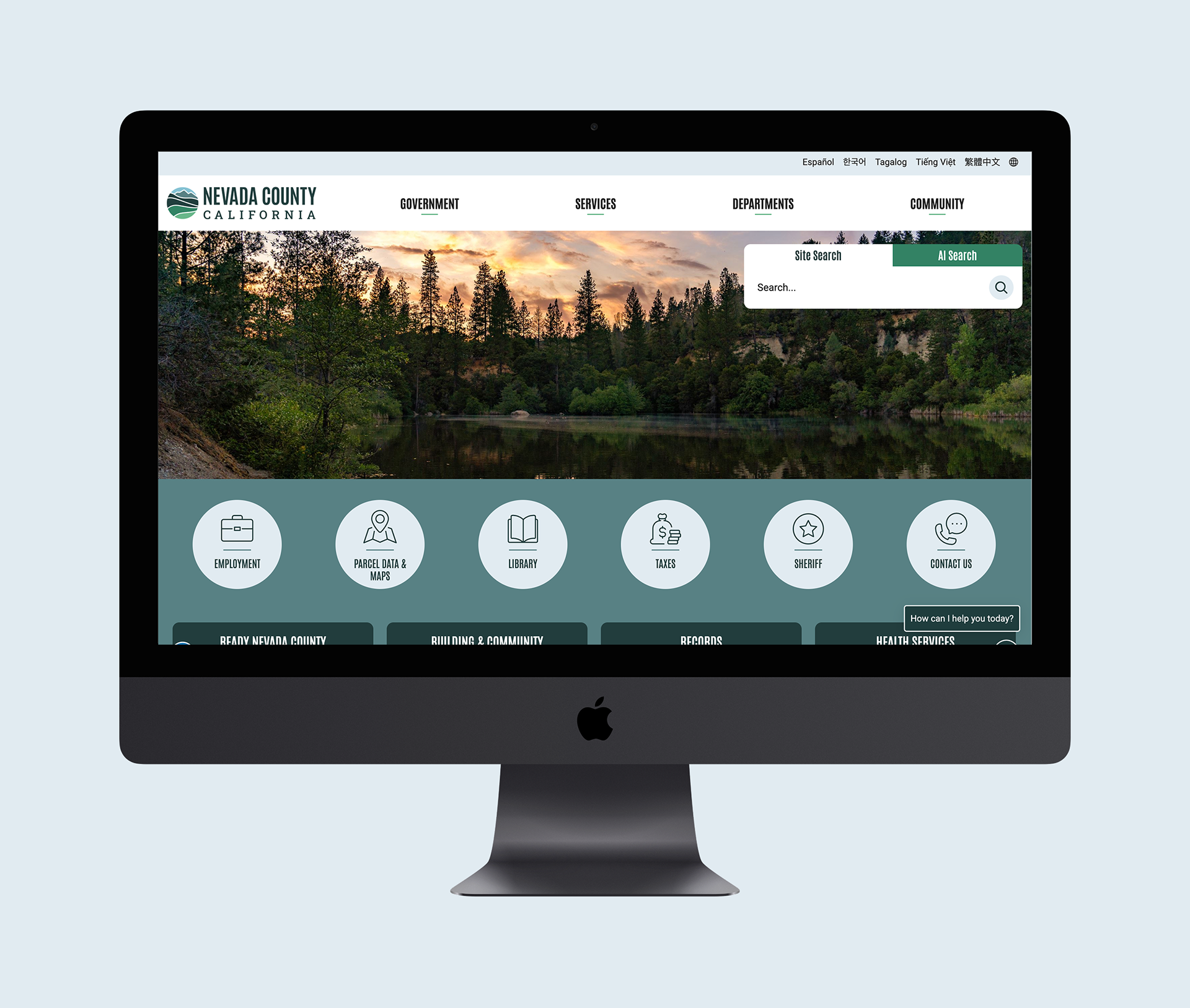
I collaborated with the CivicPlus team during the website build, providing direction on brand implementation, photography, and visual consistency so the new identity carried through the final digital experience. The work helped translate the brand system from static guidelines into a functional website experience that could support departments, services, news, and public information.
I collaborated with the CivicPlus team during the website build, providing direction on brand implementation, photography, and visual consistency so the new identity carried through the final digital experience. The work helped translate the brand system from static guidelines into a functional website experience that could support departments, services, news, and public information.
Impact
The resulting system gave Nevada County a shared visual foundation for the redesigned website and ongoing communications. It reduced reliance on department-specific marks and one-off graphics, improved consistency across public-facing materials, and gave staff a clearer framework for creating recognizable County communications over time.
The resulting system gave Nevada County a shared visual foundation for the redesigned website and ongoing communications. It reduced reliance on department-specific marks and one-off graphics, improved consistency across public-facing materials, and gave staff a clearer framework for creating recognizable County communications over time.