
211 Connecting Point connects people with local programs and services through its website and 24/7 call center. I refreshed the 211 identity to better align with Connecting Point’s parent brand while creating a flexible regional system for Nevada County, Placer County, and Tahoe-Truckee.
Challenge
Connecting Point needed a more modern 211 identity that felt clearly related to its parent brand while remaining distinct enough to function as its own public-facing service. The system also needed to scale across multiple local regions, including Nevada County, Placer County, and Tahoe-Truckee, without requiring separate logo solutions for each area.
Because 211 is a community resource used across outreach, partner communications, and public-facing materials, the refreshed identity needed to be simple, approachable, and easy to apply consistently.
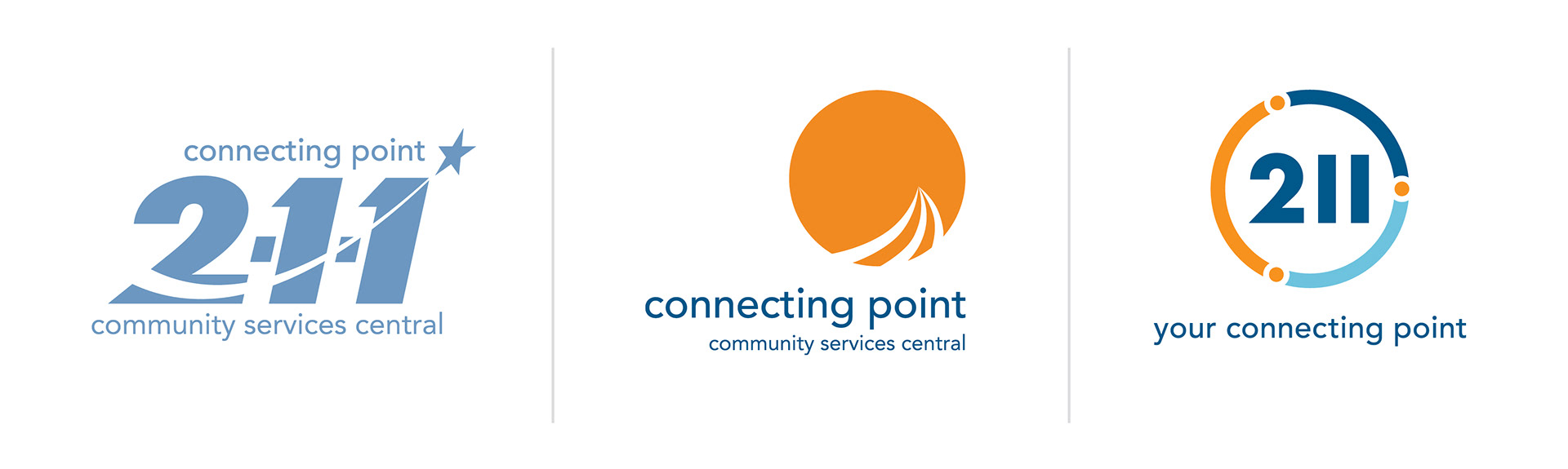
Original 211 Logo (Left) | Existing Connecting Point Logo (Center) | New 211 Logo (Right)
Identity Direction
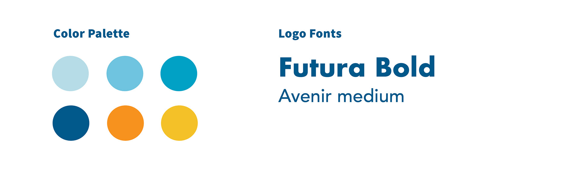
The updated identity builds from Connecting Point’s navy and orange palette, creating a direct visual link between the parent organization and the 211 service. Avenir Medium is used for the “your connecting point” tagline, reinforcing that relationship while keeping the mark clean and accessible.
The updated identity builds from Connecting Point’s navy and orange palette, creating a direct visual link between the parent organization and the 211 service. Avenir Medium is used for the “your connecting point” tagline, reinforcing that relationship while keeping the mark clean and accessible.
Regional Logo Lockups
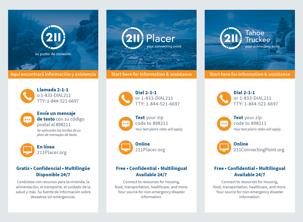
I developed regional lockups that allowed the 211 identity to represent Nevada County, Placer County, and Tahoe-Truckee within a consistent system. This gave each region a localized version of the mark while maintaining clear connection to the parent brand and reducing the need for one-off logo variations.
I developed regional lockups that allowed the 211 identity to represent Nevada County, Placer County, and Tahoe-Truckee within a consistent system. This gave each region a localized version of the mark while maintaining clear connection to the parent brand and reducing the need for one-off logo variations.
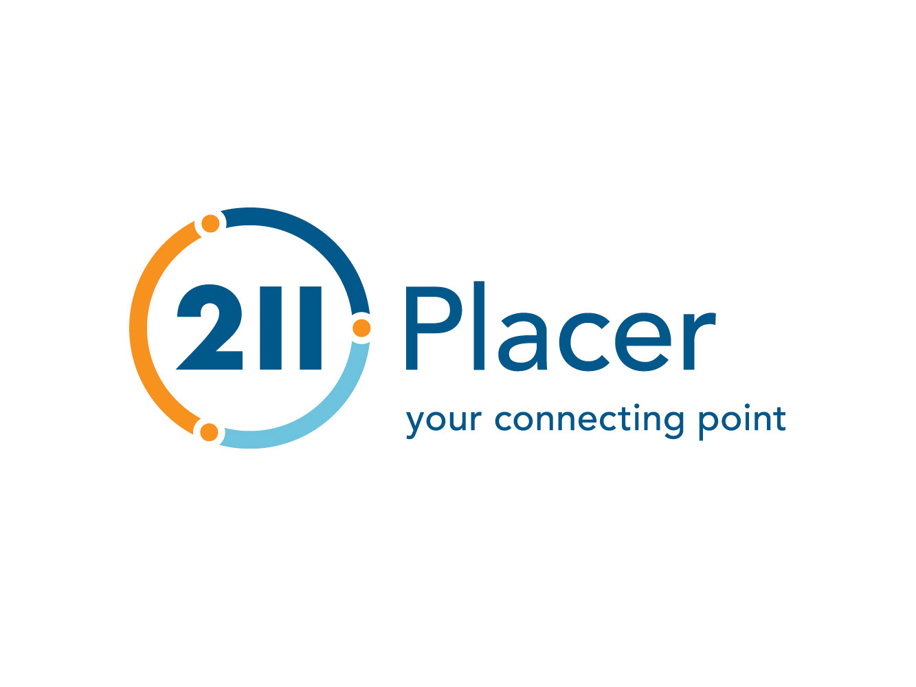
211 Placer | Full Color Logo
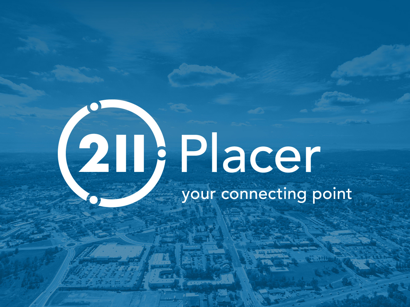
211 Placer | White Logo
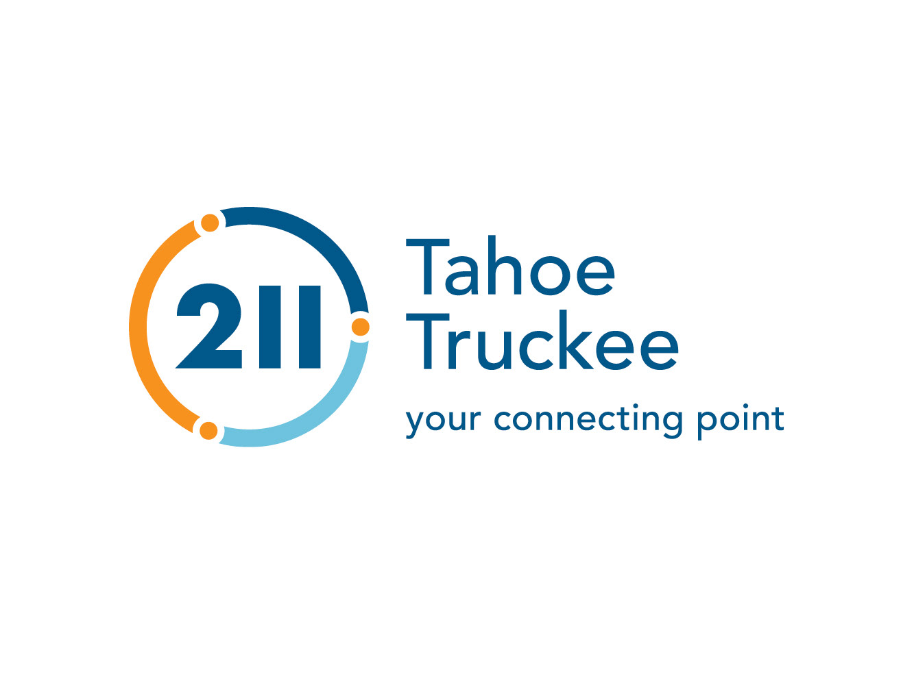
211 Tahoe Truckee | Full Color Logo
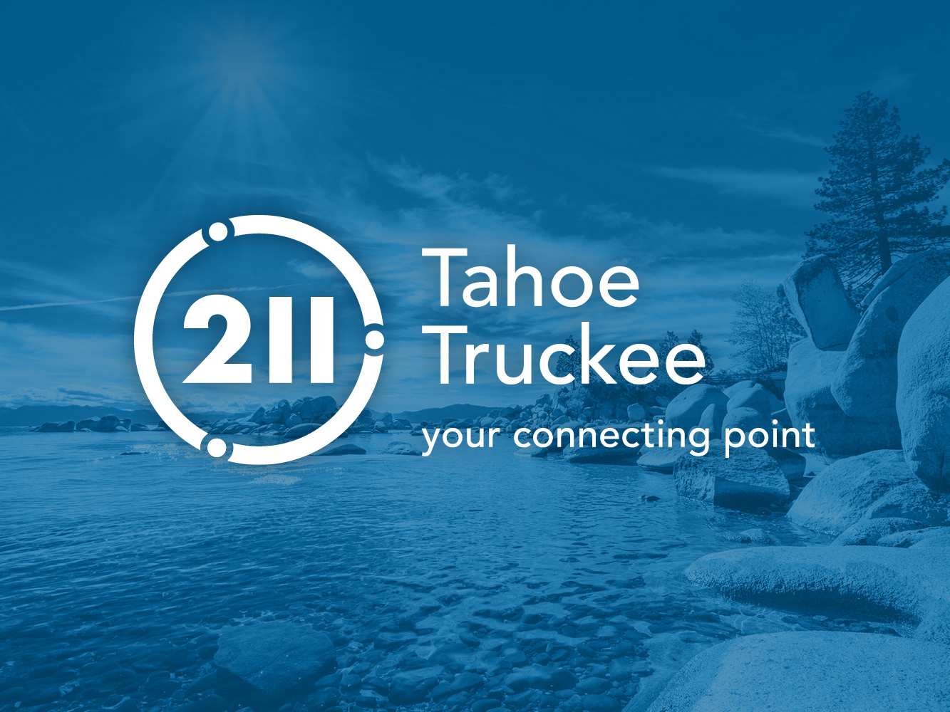
211 Tahoe Truckee | White Logo
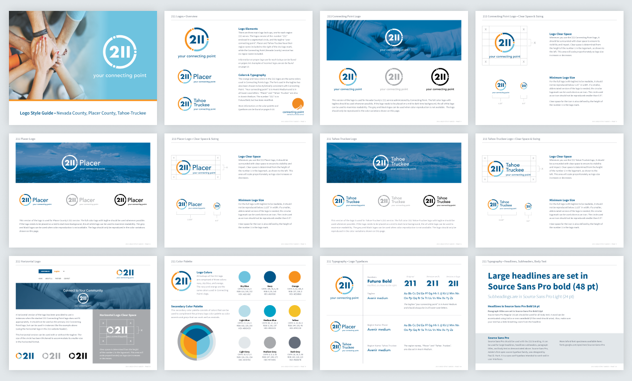
Logo Style Guide
The logo style guide documented usage rules, regional lockups, color, typography, spacing, and application guidance so the refreshed identity could be used consistently across regions, outreach materials, and partner communications.
Outreach Posters & Rack Cards
Posters and rack cards translated the refreshed identity into practical public-facing materials for community distribution. The layouts used clear hierarchy, approachable messaging, and multilingual versions in Spanish and Russian to better support regional accessibility.

211 Placer Poster | English
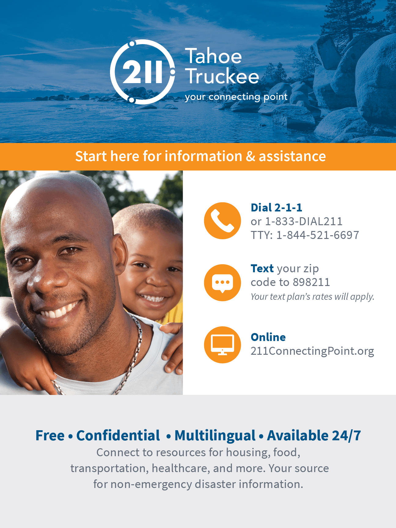
211 Tahoe Truckee | English
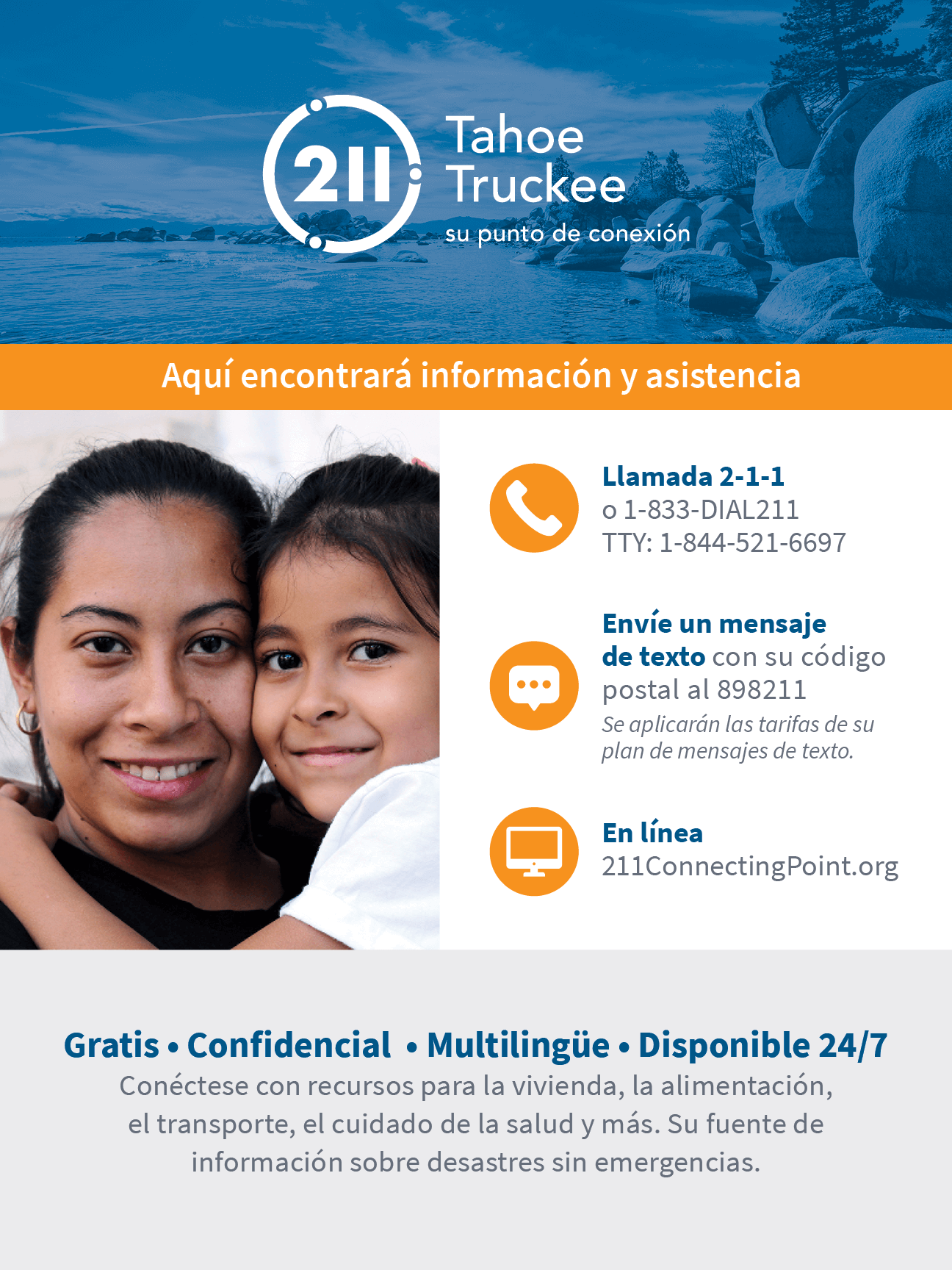
211 Tahoe Truckee | Spanish
Impact
The refreshed system gave 211 Connecting Point a cleaner, more scalable identity that could represent multiple regions while staying connected to the parent brand. The supporting guidelines and outreach materials helped make the service easier to present consistently across community communications.
The refreshed system gave 211 Connecting Point a cleaner, more scalable identity that could represent multiple regions while staying connected to the parent brand. The supporting guidelines and outreach materials helped make the service easier to present consistently across community communications.