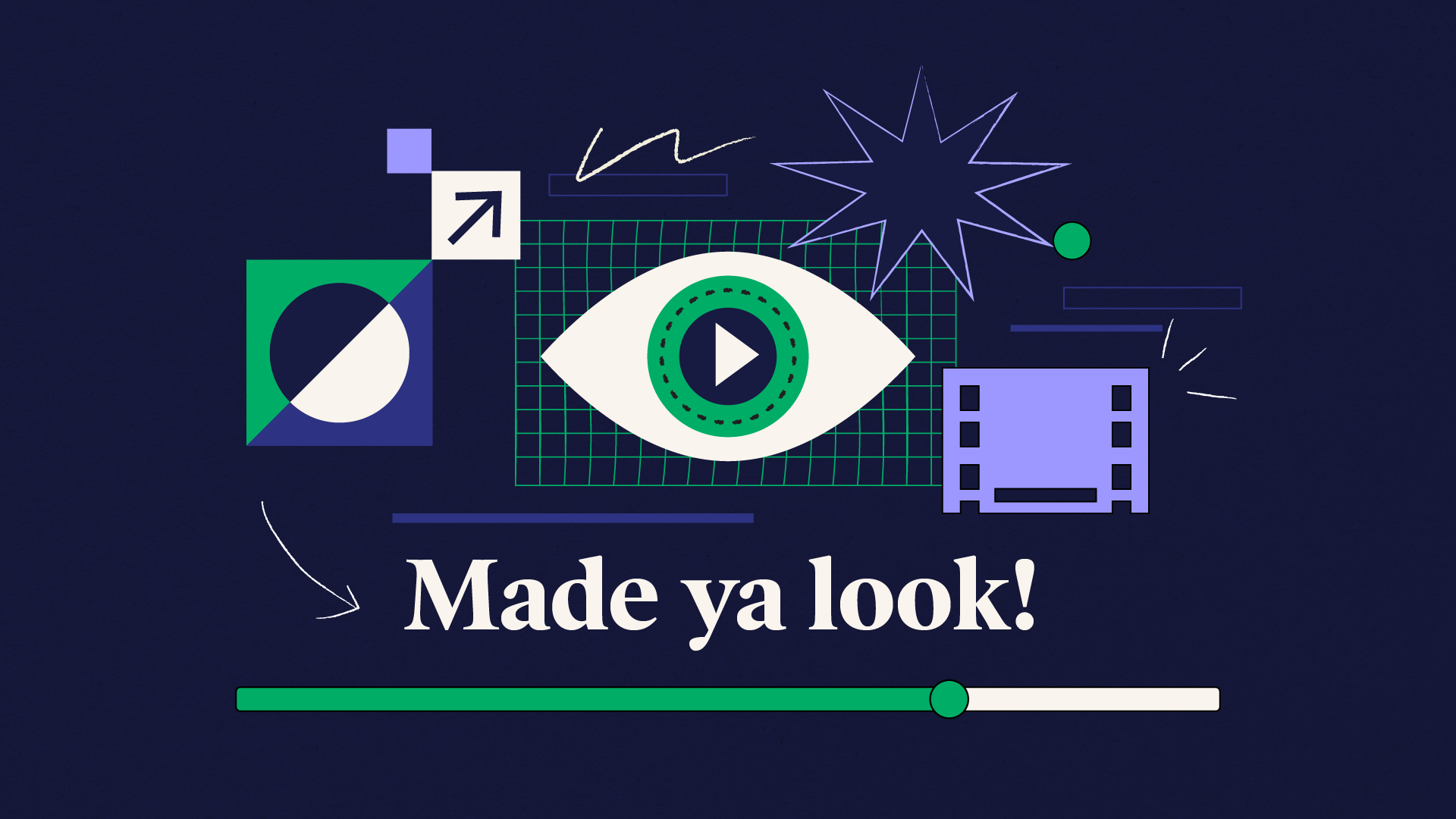
Helped bring structure and consistency to 2A Consulting’s marketing materials during a broader brand and website transition, refining the visual language, color system, and style guidance across blog, social, email, motion, and presentation assets.
Challenge
2A Consulting's marketing visuals had developed organically over time, resulting in inconsistent styles, color usage, and approaches across channels. As the agency moved toward a larger website and brand evolution, the day-to-day marketing team needed a more stable framework that could support current campaigns while leaving room for future change. The goal was to establish a more unified direction while preserving the playful, eye-catching quality of the brand.
2A Consulting's marketing visuals had developed organically over time, resulting in inconsistent styles, color usage, and approaches across channels. As the agency moved toward a larger website and brand evolution, the day-to-day marketing team needed a more stable framework that could support current campaigns while leaving room for future change. The goal was to establish a more unified direction while preserving the playful, eye-catching quality of the brand.
Approach & Role
Rather than introducing a completely new direction, I focused on building from the strongest parts of the existing visual language — bold color, playful illustration, and collage — and refining them into a more consistent, usable system.
My role centered on developing illustration guidance, expanding and organizing the color palette, improving visual hierarchy, and creating examples that could help the team apply the system consistently across formats. In collaboration with another designer, I helped develop color guidance that expanded the existing palette while establishing clearer guardrails for combinations, contrast, and application.
Once the direction was established, I continued to art direct the creative team, helping maintain consistency across the website, blog graphics, social content, email campaigns, internal materials, presentation templates, and motion-related assets.
Color Application
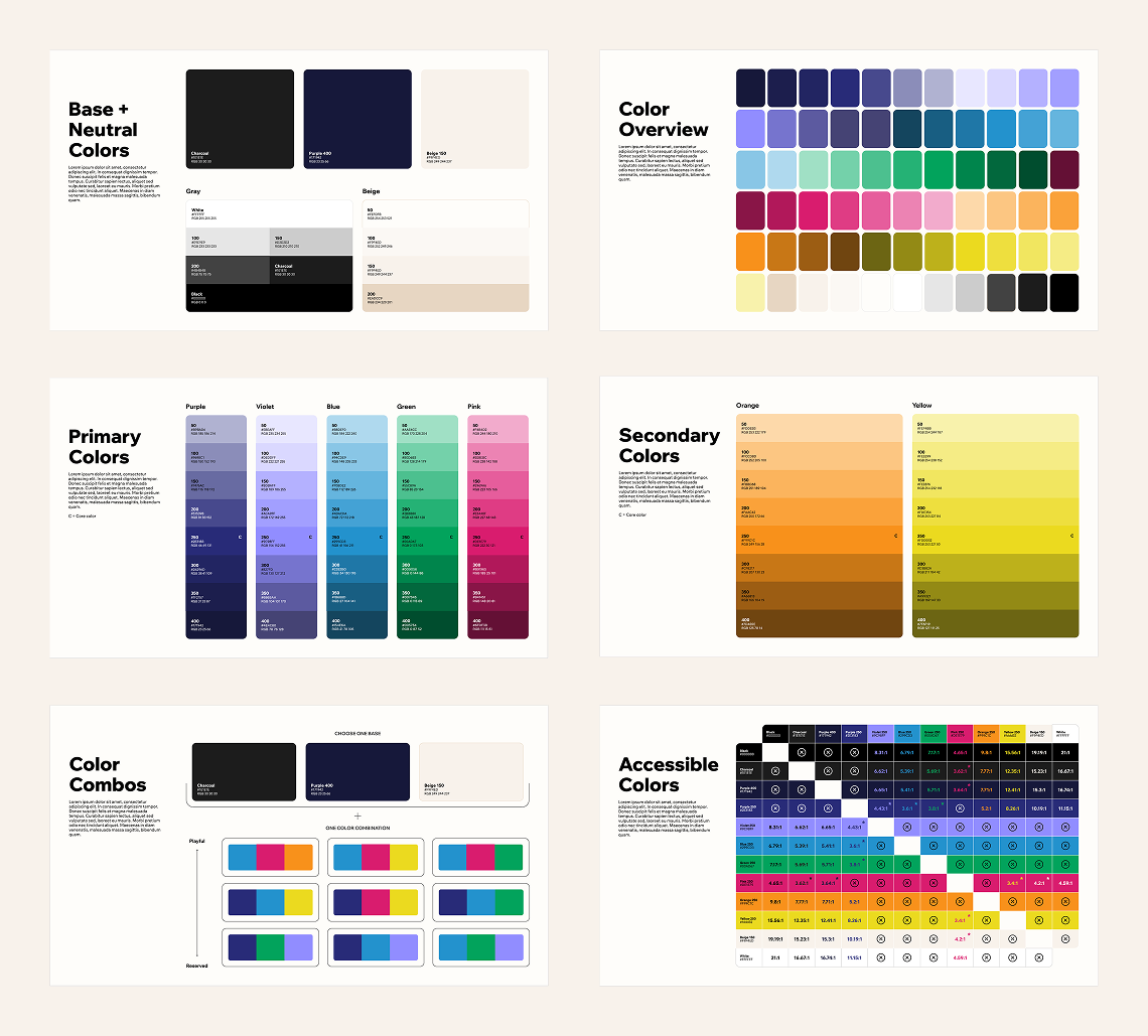
2A Consulting Brand Guidelines | Developed in collaboration with Nicole Todd
Expanded the existing palette into a more flexible working system, with clearer guidance for combinations, contrast, and application across digital formats.
Illustration Style
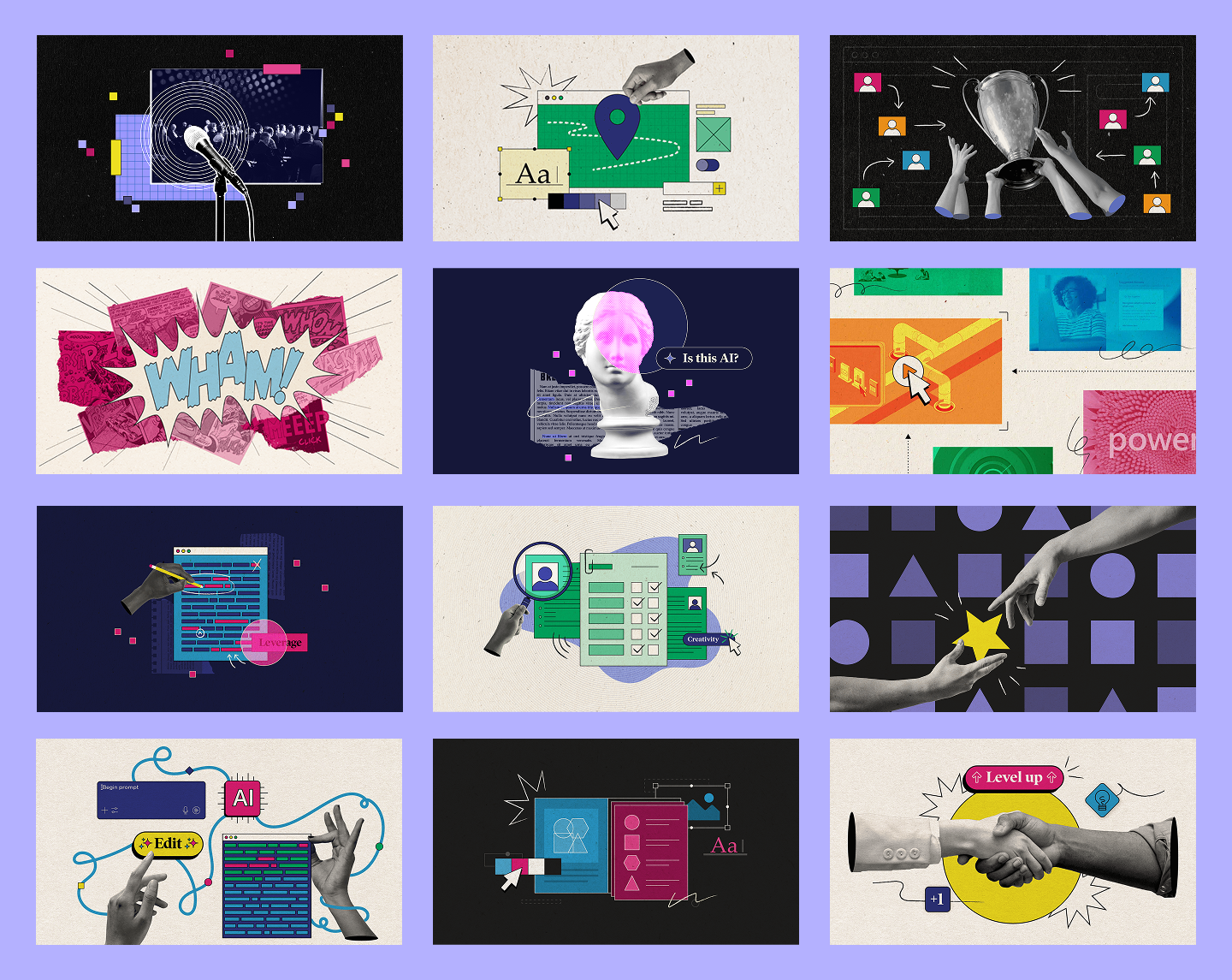
Marketing Images | Designed by: Emily Zheng, Julianne Medenblik and Nicole Todd | Art Directed: Suzanne Calkins
Defined guidance for illustration and collage usage so assets could feel energetic and varied while still belonging to the same visual family.
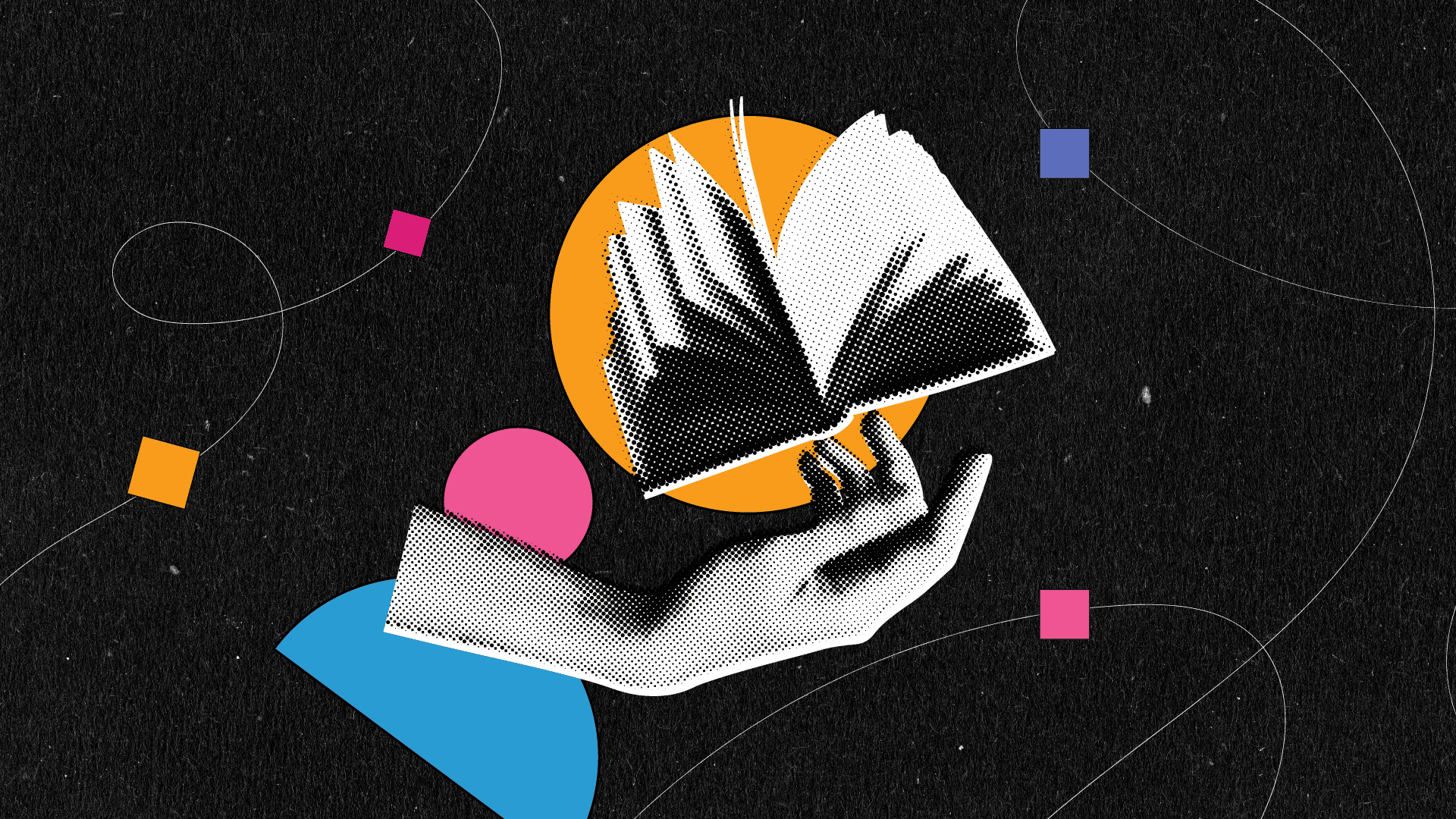
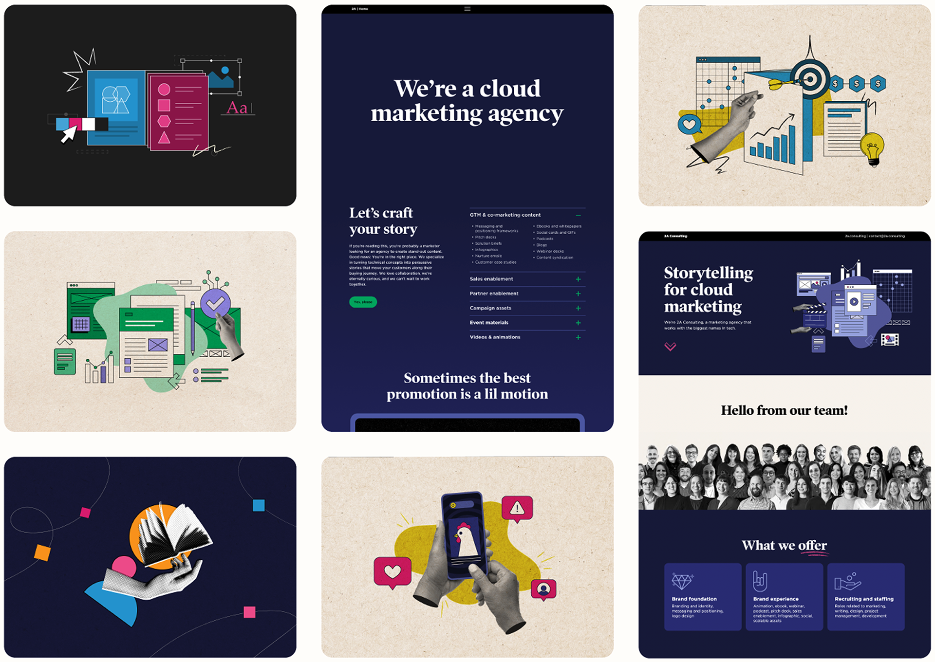
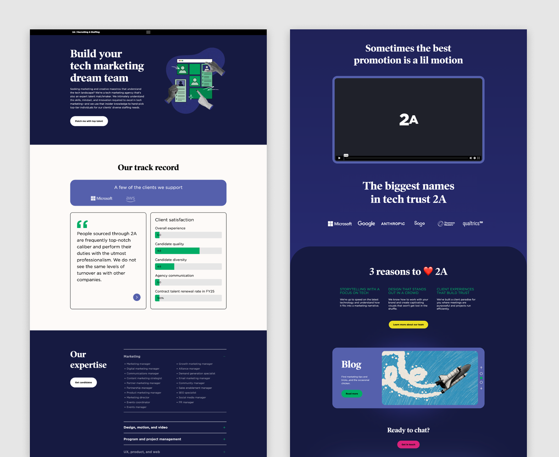
The visual language was later reflected in areas of the website and related marketing materials, helping create continuity between ongoing campaigns and the agency’s broader brand evolution.
Impact
The updated system gave 2A’s marketing materials a more recognizable and consistent presence during a period of brand transition. It created practical guidance for illustration, color, and layout, helped reduce one-off visual decisions, and supported a broader range of campaign, editorial, presentation, web, and motion-related materials.
The updated system gave 2A’s marketing materials a more recognizable and consistent presence during a period of brand transition. It created practical guidance for illustration, color, and layout, helped reduce one-off visual decisions, and supported a broader range of campaign, editorial, presentation, web, and motion-related materials.