Designed a range of community outreach materials for Connecting Point, supporting public-service programs, classes, volunteer engagement, and regional campaigns across print, digital, and social channels.
Volunteer Hub Campaign
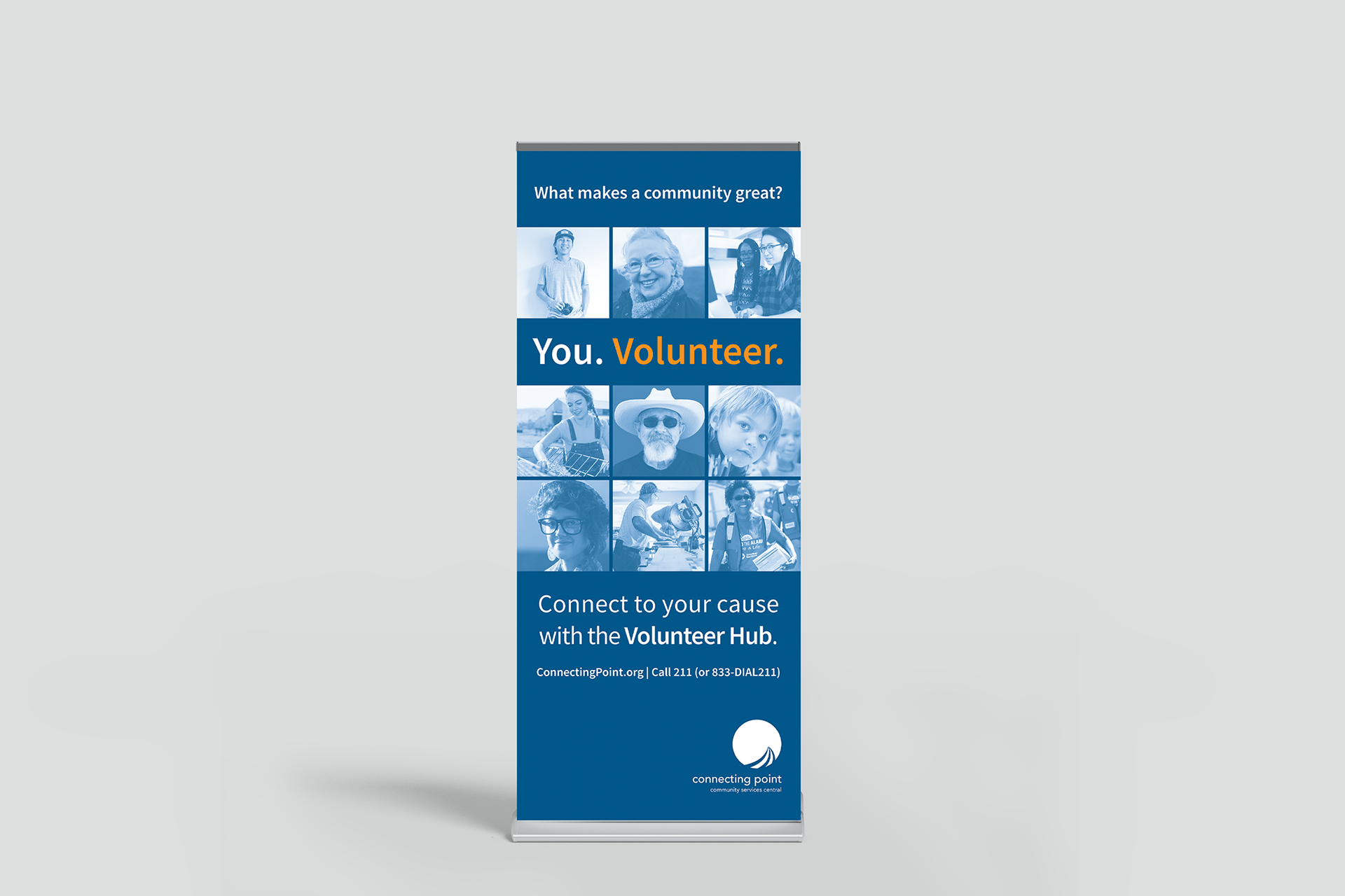
The Connecting Point Volunteer Hub is a free, web-based platform that connects Nevada County residents to local volunteer opportunities at nonprofits, schools, and public agencies. It acts as a one-stop portal for users to find, sign up for, and track their volunteer hours while helping organizations recruit and manage volunteers.

Digital Ad Design

Web Banner Design

Postcard

Pop-up Banner
Program & Class Brochures
Designed seasonal class brochures and schedules for Connecting Point’s free community trainings, including caregiving, health, wellness, and independent-living programs. The layouts organized dense schedule information into a format that was easy to scan, share, and use across community outreach.
I Count | ¡Yo Cuento!
Campaign logo design for Connecting Point's 2020 Census outreach, to be used on t-shirts, stickers and social media.
Campaign identity and outreach materials created to support local Census participation and public awareness.